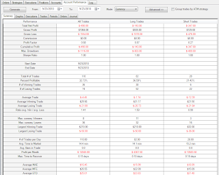
Summary:
Paper trading 200 share lots:I had a fantastic morning. I spent the afternoon trying to time a turn around in TNA and TZA. pfft.
Largest losses:
Looks like the largest stop was a $0.32/share on EDU. Again - the spread was crazy on this stock.
Why do I trade these? Sometimes I do not catch it - the spread can vary quite a bit thru the day. But this was a late day trade and I had been watching the spread all morning, so I knew. I also thought I 'knew' what was going to happen with the trade - so I took the risk. Mistake.
Largest profits:
$1.05/share on BIDU.
One thing to say about the morning - it flew by. It was fun. Trading in the Zone. The question is - was this about me - or was it about the market? What about the afternoon? Getting to that point consistently is what I am trying to accomplish, so I would like to spend some time processing what happened.
Hindsight says everything was headed down - and to be honest, it looks like the signs were there from 12:00 on. I didn't see it and expected an afternoon rally. It is apparent that I wasn't open to what was happening.
I can't say that anything changed in the afternoon . As an aside - the losses would not to have been as bad as they were (I doubled on the 3 o clock, and after it got stopped, I started trading 400 shares of TNA and TZA betting on a turn around). Here are the legit entries:
There are a couple of things I want to point out on the TNA chart. The momo started on the 2:35 gravestone. From there on out, the price doesn't come close to the stop - no messing around, the stock knows where it wants to go. That is the ideal entry. From there on, the prime entry/stop combinations vary between ends of wicks or at candle change in direction of trend (e.g., the 2:55 to 3:00 candle change). I am going to suggest that my attempts to hit a turn around were justified to some extent (at least the first try), but the stops should of been closer. For example on the 1:55 was a good momo turn around, the 1:50 stops and the 1:55 doesn't look back. Those are the kind of turn arounds I think I should expect. Yes, there are some that do not work that way, but looking at TNA, there are quite a few clean candle reversals (10:05, 12:10, 12:55, 1:05, 1:25, 2:20, 2:30). I am fairly certain Scott plays the candle change on or just above/below prior high/lows. Looking at mine, the first stop was at $0.11, the second $0.11, the third at $0.12; and they progressively got worse from there. I think I can make the stops even tighter - say $0.05. If I get stopped I should wait to see what happens.
I think if a turn around happens on strong candles it will usually be clean, if it is not clean, there isn't enough momo. So wait... and be open to seeing the trend.
I use to do these kinds of trades a lot, so I think it is worth the time to figure out why.
One more practical matter in this regard - I was talking to Fozz after the market closed about how to understand the start of a new trend - i.e., how much data should be used in the decision. Today for example, the morning's action had me in the thinking in terms of new highs all afternoon. Of course I know better - things can change at any time, but we were wondering if a guy should limit how much information he uses to determine direction. Fozz pointed out that Scott keeps the Q's and S&P windows slim - only showing about an hour worth of data. In terms of momo - this makes sense: momo carrying over from the markets to individual stocks is probably relatively short lived, with the stock's own momo carrying thru for most of the day. So I made some practical changes EOD: I changed the Q's to a 2 hour display and set up the vertical axis to auto scale based on the complete loaded data (versus just the displayed data). I did this for the stock chart as well and set grid line spacing to $1. Now I can tell at a glance how much a stock is moving and whether or not it is worth trading.
In addition to the chart changes I want to start thinking of the day in three parts - morning, lunch, and afternoon, giving each a clean slate and permission to do its thing.
So did I lose the flow this afternoon? I am going to say I did and chalk it up to a lack of 'knowing myself' skill; my tendencies proved too challenging for my skill set. Essentially, I did not have enough skill to be aware of and curtail my tendency to persist in a particular mindset. After the good morning, I didn't look at or read the 5/7. Maybe that had something to do with it.
After thinking about it, I need to adapt on two fronts, persistence on owning the 5/7 even when things are going well, and some logistical changes to aid in focusing and helping to reduce my tendency to bias.
So many pretty charts today. I started marking charts with a red square, if for example I was late to the party and wanted to see what would happen as the day progressed. But that didn't work very well. I think I will try arrows tomorrow.
I didn't include the TNA and TZA charts - the only legitimate entries are the ones I show above.
Trade well.
Details:
ANR:APA - gotta remember that double top/bottom failed breakout syndrome:
APOL:
BID:
BIDU - profits, then I proceeded to give too much of it back:
CECO:
COG - everything was going fine...:
CPRT - I caught the breakout... but forgot to notice that this was the largest candle of the day. It was a $0.45 profit... that came back and got stopped. You never know:
CROX:
CSTR - notice the red square on the 12:35. This is when I spotted the stock. I was late, but look how much room was left. The 1:25 entry should of had a tighter stop, I was looking for a reversal with momo:
CYMI:
DV - I don't recall what prompted the first exit...:
EDU - again, note the red square, this came to my attention sometime during that candle. The spread was crazy though, and I shouldn't have been in the long later in the afternoon:
FCX - hanging out at $85.00 for most of lunch:
KMX - I didn't trade this and can't recall when I spotted it, but it is a nice chart:
MAC - saw it on the breakdown, which failed - but the next one had plenty of room - remember the question Fozz? =):
MCK - I had the right idea on the short. I put a cover limit on the $59.00 mark. When it hesitated at $59.11 I almost covered, but then decided just to let it ride to see what would happen. I actually reversed then prior to the stop, but got out too early:
NFG:
NTAP - not sure why I traded this. I think it was because I remembered it moving late yesterday, but looking back it wasn't that great of a move:
SCCO:
SWN - probably the poorest entry of the morning:
TECD - again.. double tops... If this happens enough I think it will begin to soak in:
VRX - exit looks nervous, but I don't recall:


